GUAJIRO
Guajiro
Brand Identity Project.
What we did
Industry
Retail Food
The Name:
GUAJIRO
At Guajiro, we believe that true luxury lies in freshness, purity, and quality. Our gourmet
eggs are laid daily by all-natural-fed hens and delivered fresh from the farm to your table— ensuring an unparalleled culinary experience. Designed for discerning customers who seek
the best in nutrition and taste, Guajiro is more than just an egg; it’s a commitment to excellence, sustainability, and ethical farming.
With “EGGS FROM TODAY”, we set a new standard—where freshness isn’t just a promise, but a guarantee. Welcome to Guajiro, where every egg tells a story of quality, care, and exclusivity.
01. Brand Heart
Purpose:
Guajiro exists to redefine the egg industry by providing fresh, high-quality gourmet eggs from chickens raised on an all-natural diet. Our mission is to ensure that consumers experience unmatched freshness, superior nutrition, and ethical sourcing—all in a daily offering.
Customer-Centric Approach:
Customer satisfaction is at the heart of everything we do. We listen to our customers’ feedback and strive to exceed their expectations by providing exceptional products and personalized service.
Vision:
We envision a future where premium-quality eggs become the standard for high-end consumers who value freshness, nutrition, and ethical farming. Guajiro aims to be a leading name in the gourmet egg industry, setting benchmarks for quality, sustainability, and exclusivity.
Mission:
Guajiro is dedicated to:
Delivering daily fresh, gourmet-quality eggs to high-end customers.
Raising chickens on a 100% natural diet, ensuring superior nutritional value.
Providing an exclusive experience where consumers can trust the source of their food.
Setting new industry standards by emphasizing freshness and ethical production.
Values:
1- Freshness First – Every egg is produced, collected, and delivered daily.
2- Uncompromising Quality – Only the best nutrition and ethical farming practices.
3- Sustainability – Prioritizing eco-friendly, all-natural feed and humane farming.
4- Transparency – Customers know exactly where their food comes from.
5- Exclusivity – Designed for discerning consumers who expect the best.
02. LOGO
CONCEPT
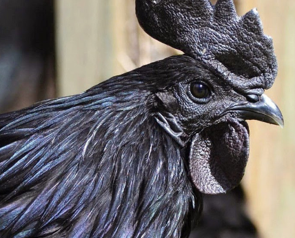
HIGH-QUALITY

HERITAGE

ORGANIC
LOGOTYPE CONSTRUCTION
The “Guajiro” logo is a dynamic and artistic representation that combines expressive line art with a minimalist aesthetic. The design
is characterized by a hand-drawn, abstract illustration that evokes the essence of spontaneity and cultural identity.
Key elements of the logo include:
Symbolism: The illustration depicts a stylized rooster, a common cultural symbol associated with resilience, rural traditions, and energy.
Typography: The word “Guajiro” is written in a clean, handcrafted font, reinforcing the brand’s artisanal and organic nature.
Color Palette: Using black outlines with bold orange accents creates a striking visual contrast, adding warmth and vibrancy to the design. Composition: The sketch-like style gives the logo a modern yet rustic feel, making it unique and memorable.
This logo effectively conveys authenticity, creativity, and cultural heritage, making it well-suited for a brand that values craftsmanship, tradition, and artistic expression.
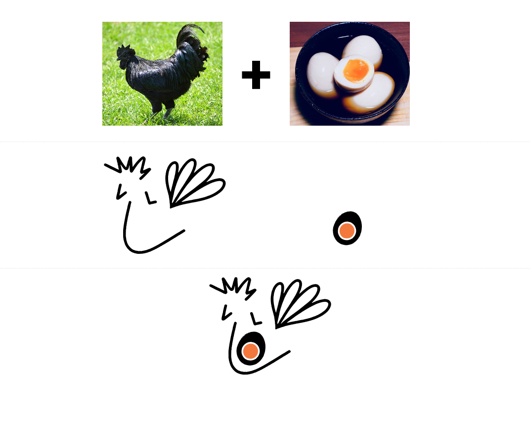
ISOTYPE CONSTRUCTION
A minimalist and abstract representation of a rooster, symbolizing vitality, tradition, and cultural heritage. The design comprises expressive hand-drawn black lines, creating a sense of movement and spontaneity.
Key Design Elements:
Abstract Rooster Illustration: The composition includes a beak, a circular eye with an orange accent, a comb suggested by jagged lines, and a stylized wing resembling a heart shape. Hand-Drawn Aesthetic: The raw, sketch-like quality of the lines adds an artisanal and organic feel, reinforcing authenticity and creativity.
Color Palette: The use of black for the outline provides contrast, while the orange circle adds warmth and emphasis, drawing attention to the focal point of the design.
Symbolism: Roosters are often associated with awakening, leadership, and rural traditions, making this logo ideal for a brand that values craftsmanship, identity, and heritage.
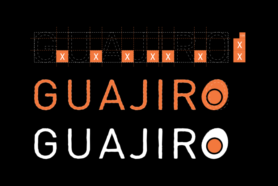
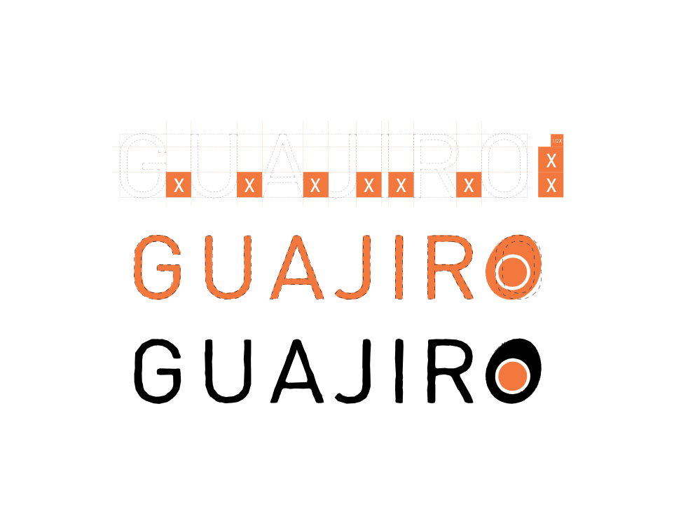
LOGOTYPE
The GUAJIRO logo presents a bold yet minimalist typographic design that captures authenticity, tradition, and cultural identity. The hand-drawn lettering exudes an organic and artisanal feel, emphasizing craftsmanship and a connection to heritage.
Key Design Elements:
Custom Hand-Drawn Typography: The irregular, slightly imperfect strokes give the logo a raw, human touch, reinforcing authenticity and individuality.
Bold Black Lettering: Black enhances legibility and provides a strong visual impact, making the brand name stand out.
Distinctive ‘O’ with Orange Accent: The final letter ‘O’ is uniquely stylized with an orange inner circle enclosed by a bold black outline, creating a focal point that draws attention and adds warmth to the design.
Cultural and Artistic Symbolism: The name “Guajiro” refers to rural or native cultural roots, and the design reflects this essence through its handcrafted aesthetic, making it ideal for brands connected to tradition, heritage, or craftsmanship.
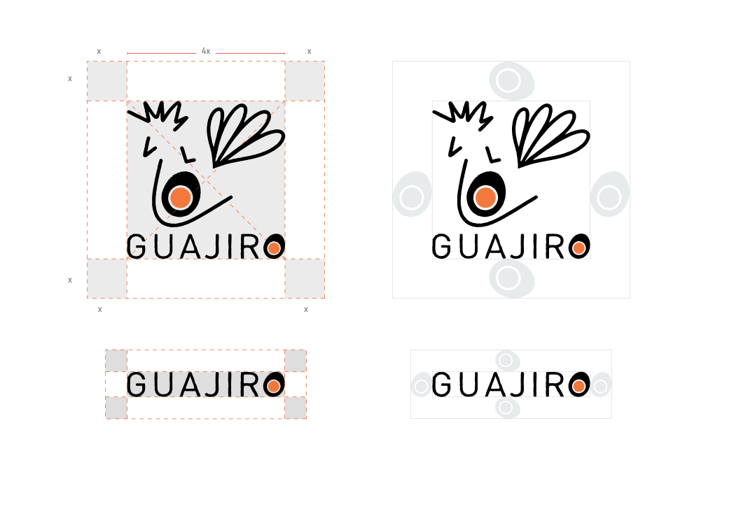
EXCLUSION ZONE
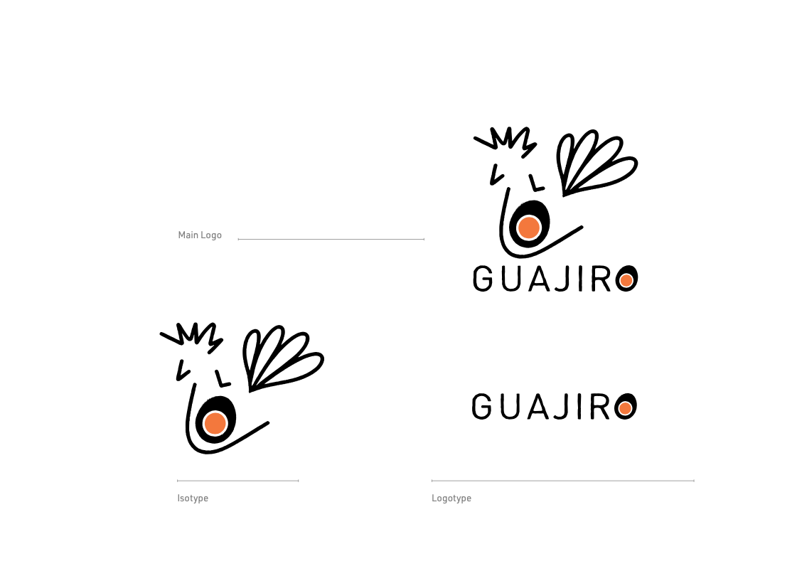
The isotype was constructed with a 5X x 5X proportion (square). The exclusion zone means “ 1x” places around this isotype. Using any graphics within the “1x” proportion is prohibited.
Using anything inside these “1x” will break the brand guidelines.
LOGO SYSTEM
The logo is designed to use primary as the main logo: Isotype and logotype,
The logo has secondary uses depending on applications, materials, and marketing purposes
CLEARSPACE
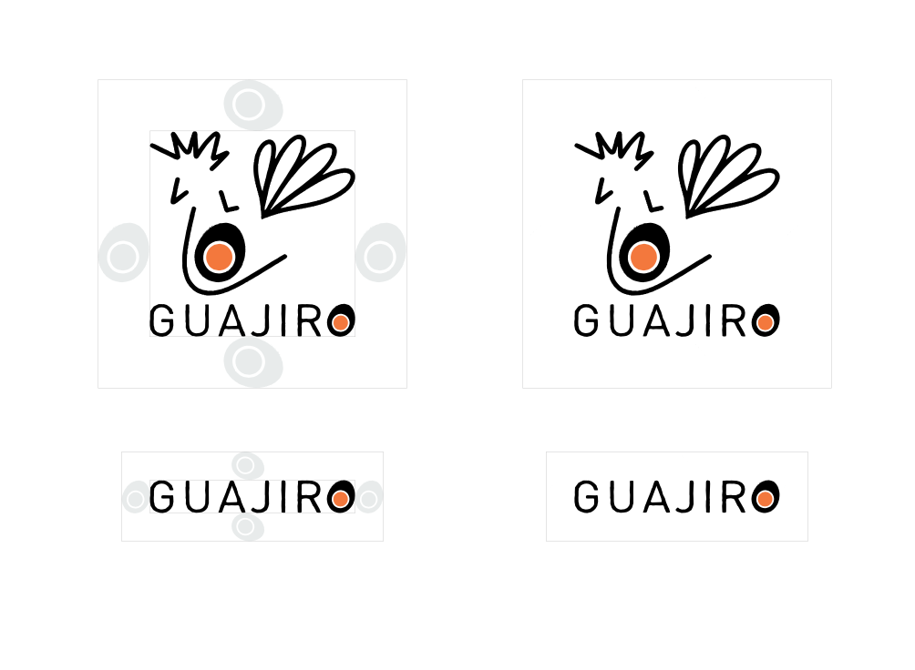
The GUAJIRO logo should always have a minimum amount of clear space to ensure optimal readability.
This space isolates the mark from any competing graphic elements, such as other logos or body copy, that may conflict with, crowd, or diminish the overall impact of our mark.
Primary logo version vertical
• isotype
• logotype
SIZE
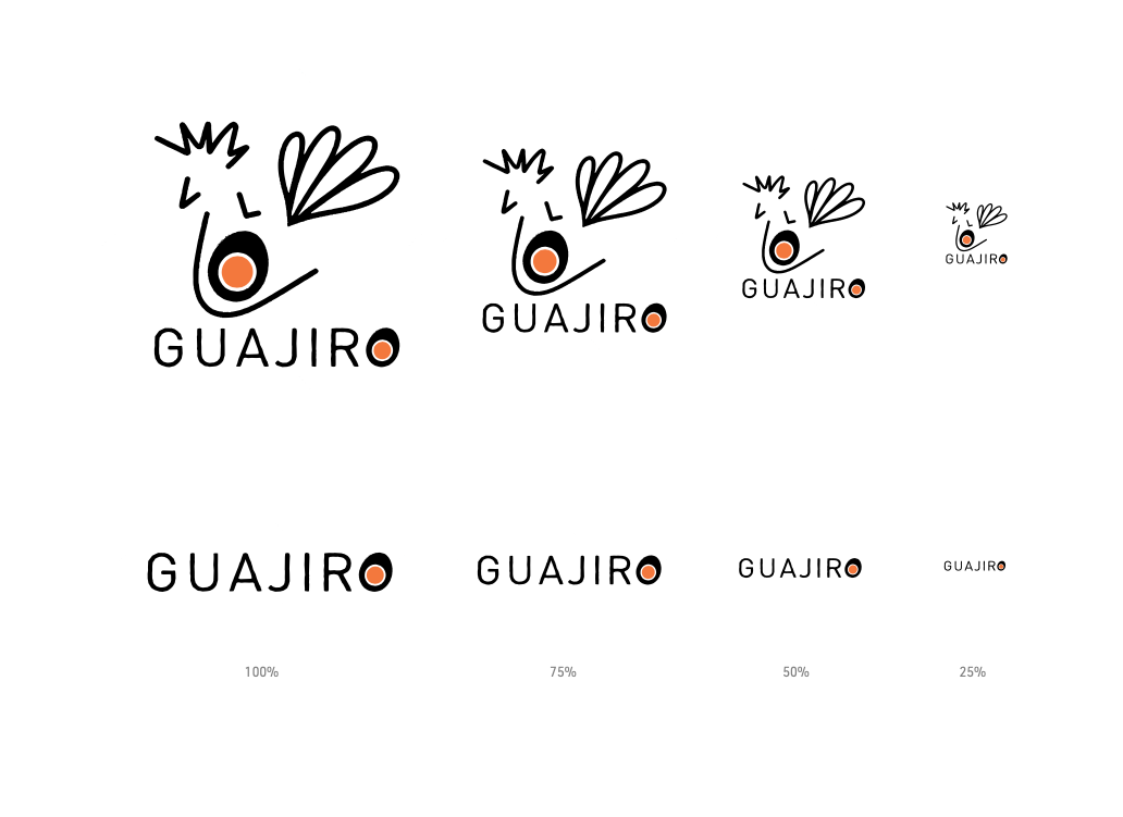
For legibility, the logo should not be used anywhere (print or web) below the following sizes. If the logo is used below, it will lose clarity and beauty.
When the logo is used up to the sizes tested in each variation, it will keep its legibility intact.
LOGO PLACEMENT
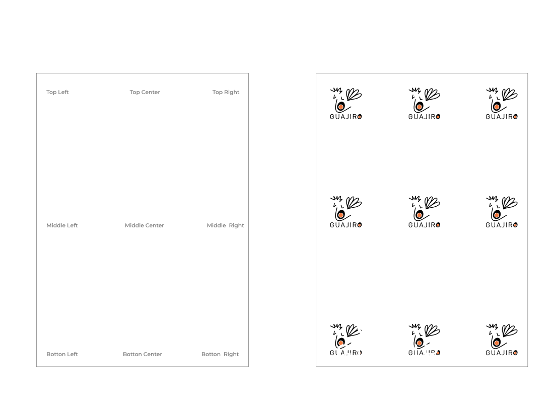
The logo should not be used anywhere on a page. The logo can lose its structure if used randomly anywhere on the page.
Brand Identity Project.
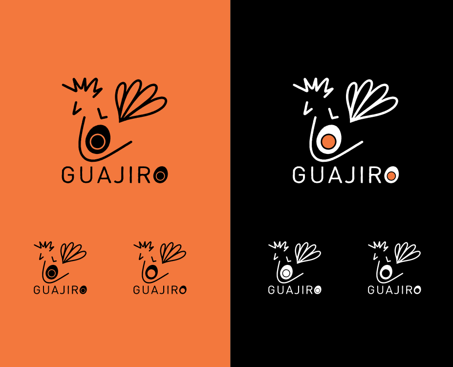
LOGO ON THE BACKGROUND COLOR
Cadmium Orange & Black are the primary brand colors and should be the default choice when using the GUAJIRO logo.
Additionally, we’ve developed an alternate color System to allow for more flexibility when using other brands’ elements such as iconography (e.g., website packaging, materials, etc.).
These colorways successfully pass color contrast testing.
APP ICON
GUAJIRO isotype can be used in different colors variations in social media and
app formats.
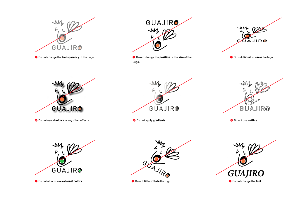
INCORRECT USAGE
Here’s what you shouldn’t do with our logo.
Remember that we convey an identity rooted in our values, and the best way to preserve it is to present our brand consistently and accurately and respect our brand guidelines.
• Change the logo’s orientation or rotation.
• Disproportionately scale the logo.
• Change the logo’s colors.
• Display the logo with color combinations not previously specified.
• Display the logo in a configuration not previously specified.
• Attempt to recreate the logo.
• Make alterations to the logo’s text.
• Add special effects to the logo.
• Add an outline to the logo or display the logo as an outline.
• Use the logo on top of the busy photography.
03. COLOR
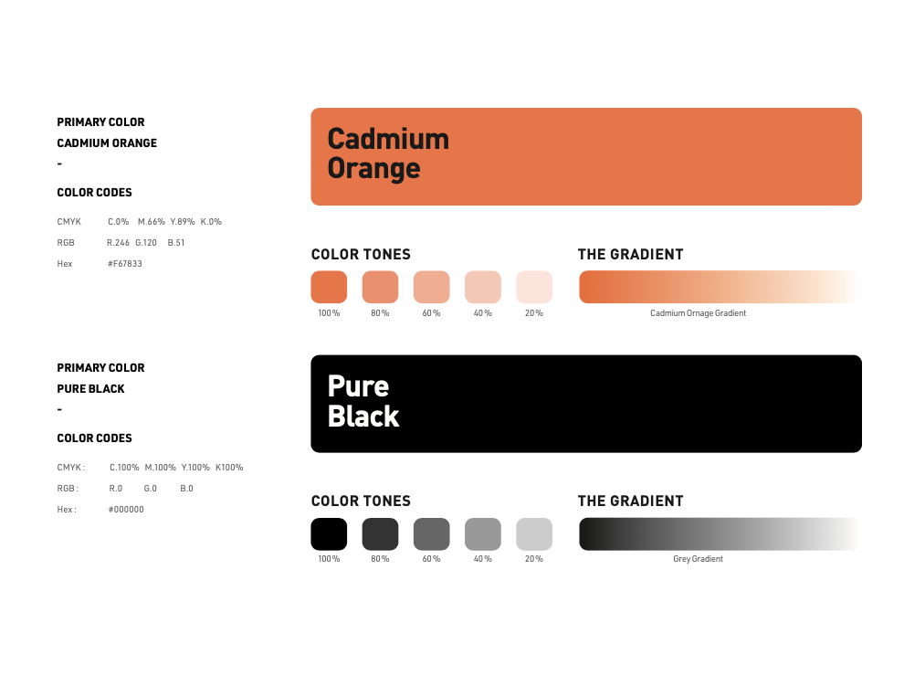
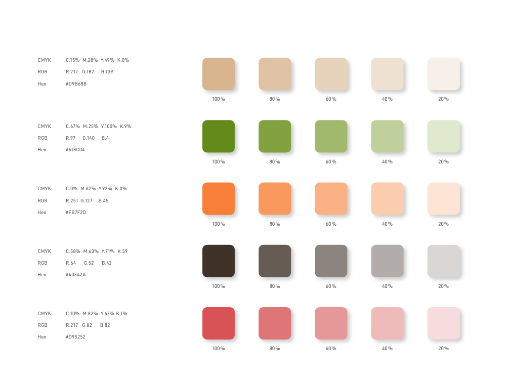
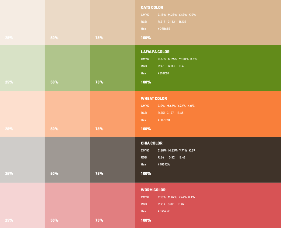
PRIMARY COLOR SYSTEM
Color plays a vital role in the GUAJIRO brand identity. The colors below are recommendations for various media. A palette of primary colors has been developed, which comprise the “One Voice” color scheme.
Consistent use of these colors will contribute to the cohesive and harmonious look of the GUAJIRO brand identity across all relevant media. Check with your designer or printer that they will always be consistent when using corporate colors.
EXPLANATION
The GUAJIRO’S Brand has two official colors:
Cadmium Orange and Pure Black. These colors have become a recognizable identifier for the company.
USAGE
Use them as the dominant color palette for all company internal and external visual presentations.
THE SECONDARY COLOR SYSTEM & COLOR CODES
Explanation:
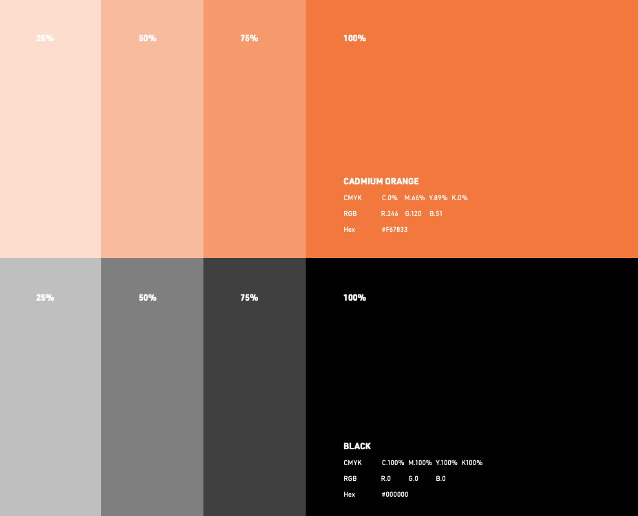
The Secondary colors complement our official colors but are not recognizable identifiers for GUAJIRO’S.
Secondary colors should be used sparingly, that is, in less than 20 percent of the palette in one piece.
Usage:
Use them to accent and support the primary color palette.
04. TYPOGRAPHY
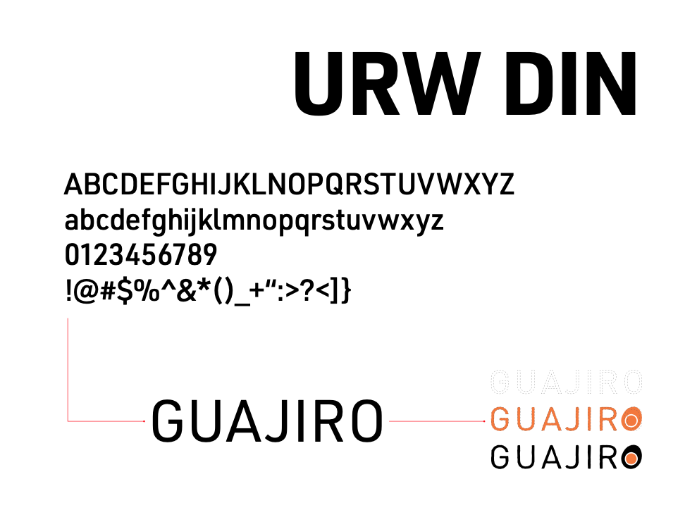
PRIMARY TYPEFACE
URW DIN was designed by Volker Schnebel and published in 2017. However, the DIN family, a sans-serif typeface, was first used to identify railroad cars in Germany.
It is based on the original German Standards Organization font number DIN 1451, which was commissioned for use in German public administration and signage. It supports up to 48 typefaces and 21 languages.
Known for its intentionally unrefined and primitive look, it looked like an engineer rather than a designer created it.
Even at a small point, URW DIN maintains its readability on mobile applications, business cards, product packaging, headlines, and the fine print on documents, which is useful when conveying a clear message.
URW Type Foundry GmbH is a German company with a long and rich history in type design and engineering. As the direct successor of digital type pioneer URW GmbH, it continues to design and develop first-class typefaces and custom projects.
URW Type Foundry GmbH is renowned for its comprehensive library, specialization in global font technology, and overall role in type development.
SECONDARY TYPEFACE
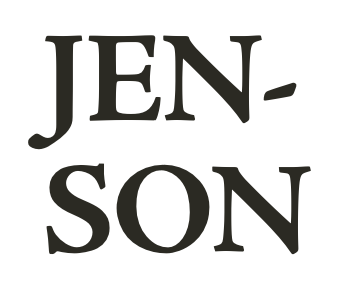
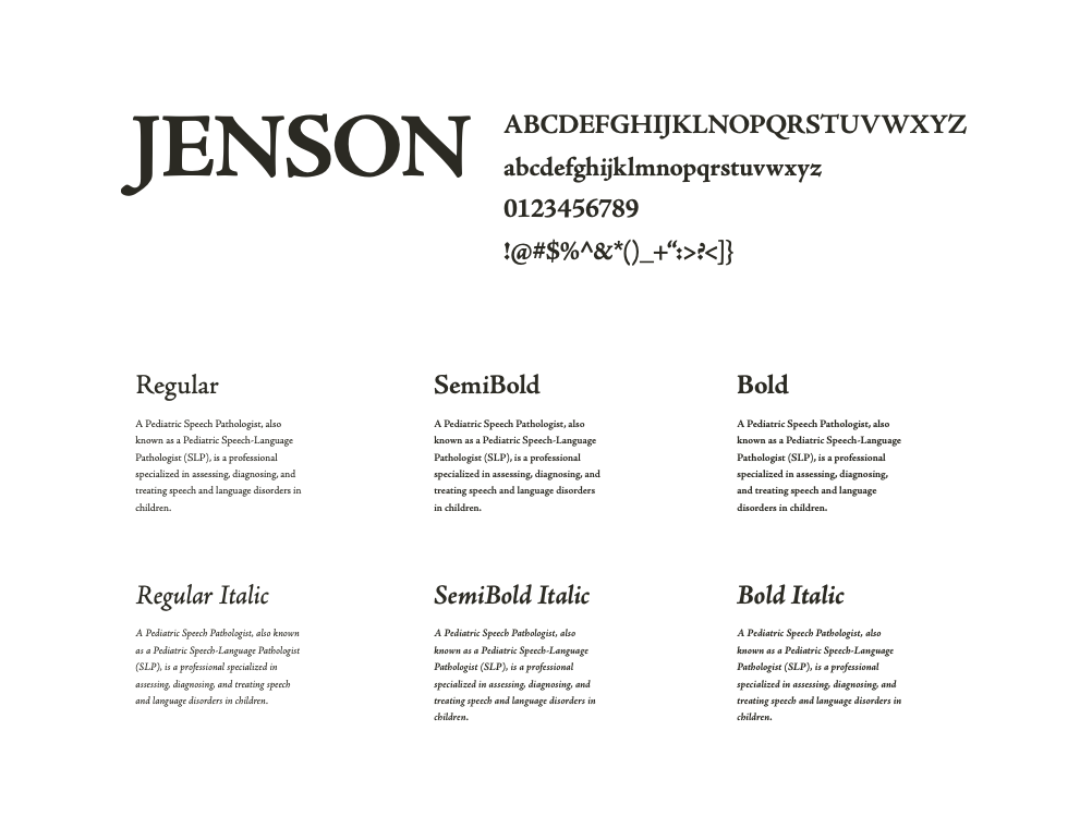
Adobe Jenson Pro captures the essence of Nicolas Jenson’s Roman and Ludovico degli Arrighi’s italic typeface designs. The combined strength and beauty of these two icons of Renaissance type result in an elegant typeface suited to a broad spectrum of applications. Designed by Robert Slimbach of the Adobe type design team, Adobe Jenson Pro is part of the family of Adobe Originals historical revivals, including Adobe Garamond Pro and Adobe Caslon Pro. With its many OpenType features, extended language support, and typographic refinement, Adobe Jenson Pro provides power and flexibility for text composition rarely found in digital type.
TYPOGRAPHY IN USE
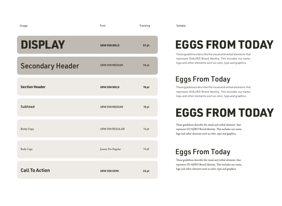
The usage guide on the right shows the best practices for setting the type for most GUAJIRO communications. The only derivation from this would be instances of large, longer copies that can be put in URW DIN rather than JENSON.
Headlines should always be in sentence case (i.e., capitalize all letters). They should use end punctuation, except for specific graphic executions.
Section headers and subheads must be in sentence case, and end punctuation must be used.
The “call to action” must be in sentence case and use end punctuation.
05. ICONOGRAPHY
THE BRAND SYSTEM
Explanation:
The Secondary colors complement our official colors but are not recognizable identifiers for GUAJIRO’S. Secondary colors should be used sparingly, that is, in less than 20 percent of the palette in one piece.
Usage:
Use them to accent and support the primary color palette.
06. IMAGERY
THE BRAND IMAGERY
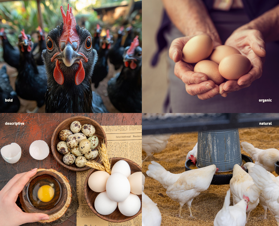
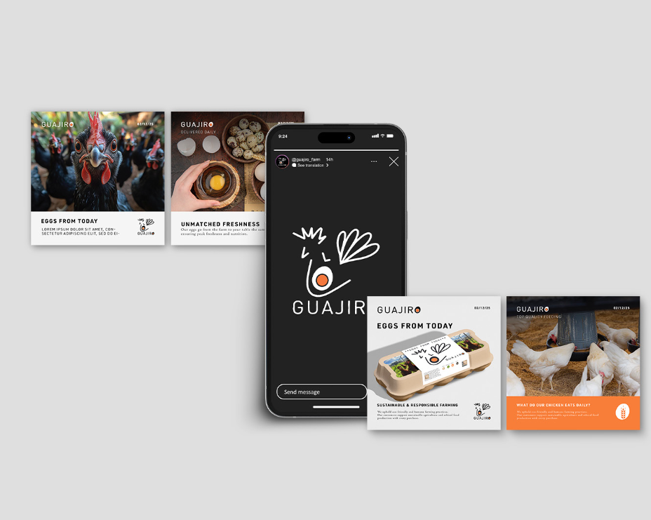
Following are some images displayed that will speak for our business. And by looking at the pictures, everyone will understand about the product essence.
07. APPLICATIONS
SOCIAL MEDIA
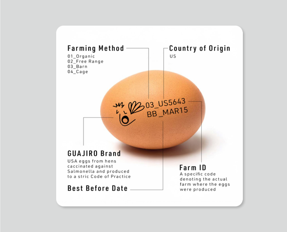
INFOGRAPHIC
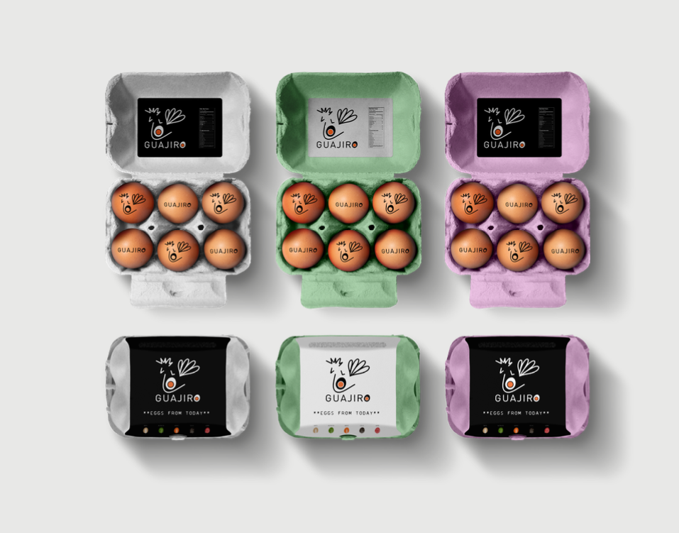
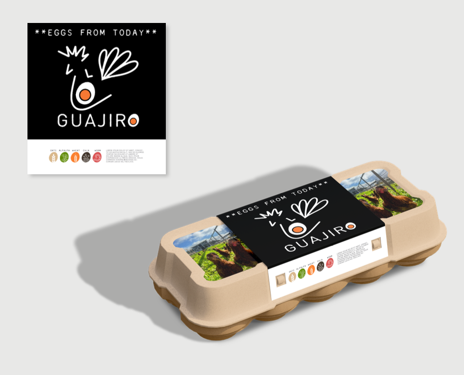
PACKAGING
VER_1
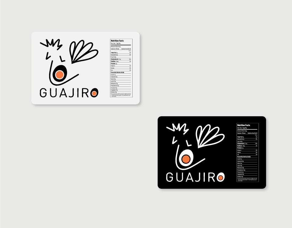
INSIDE LABEL
FACTS
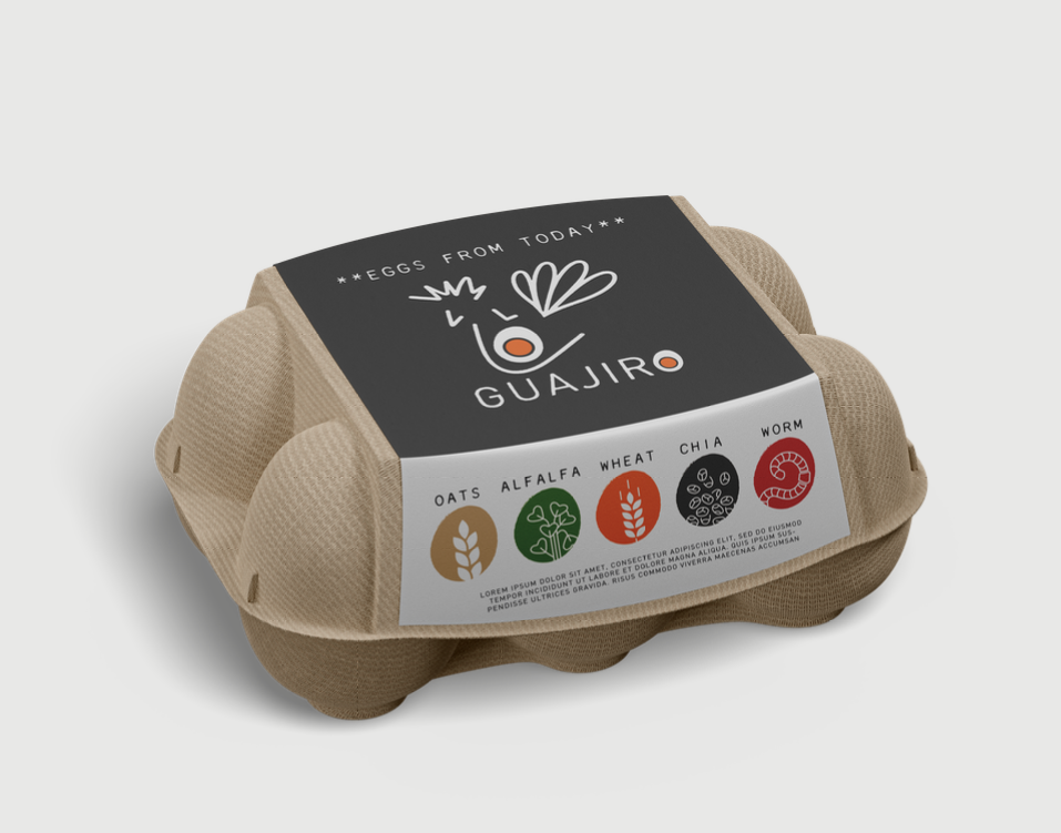
PACKAGING
VER_2
PACKAGING
VER_3
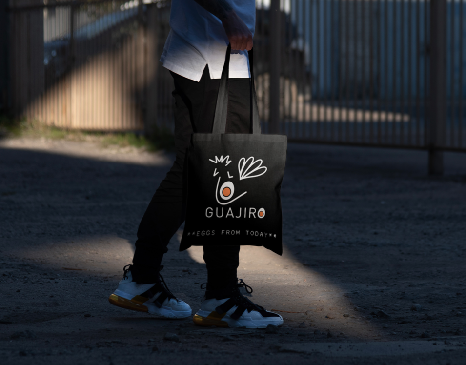
TOTE
BAG
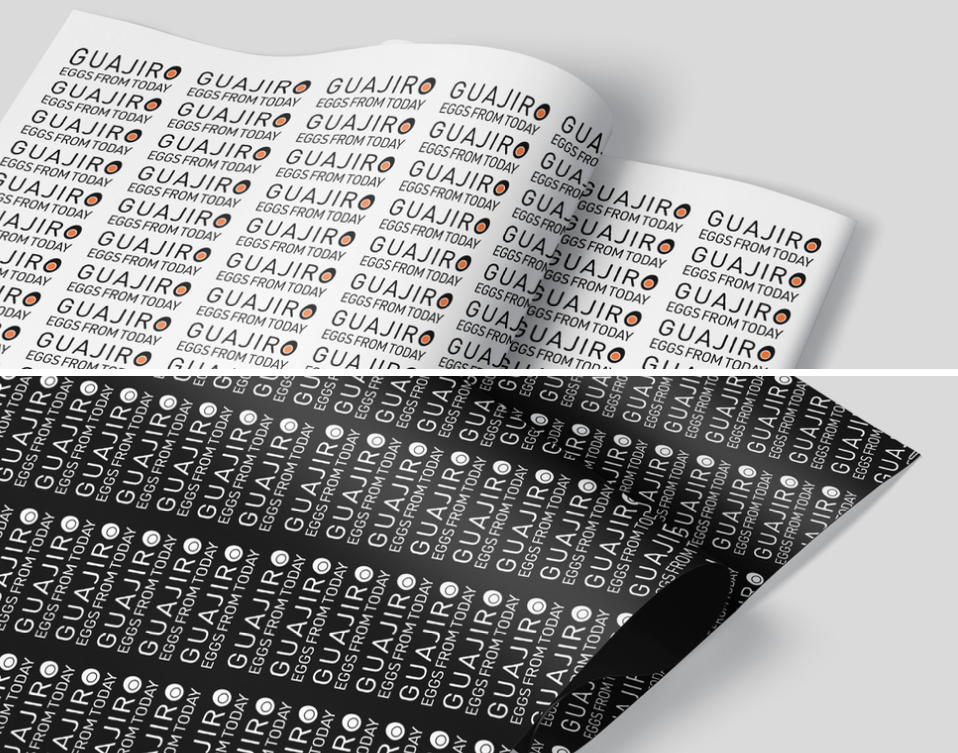
GIFT
PAPER
