EFECTO ESPEJO
Efecto Espejo
Brand Identity Project.
What we did
Industry
Beauty
The Name:
EFECTO ESPEJO
The Brand Identity Project for Efecto Espejo is rooted in meeting the needs emerging from the pandemic-induced product shortages. Dissatisfied with the market offerings, we journeyed to organically and naturally satisfy our customers.
Our commitment to nutrition extends beyond the traditional sense. We focus on delivering essential nutrients like proteins, vitamins, and minerals for hair health. We aim to fortify and safeguard hair, minimizing the risk of hair loss.
- Complete elimination of frizz for impeccably smooth hair.
- Hair restructuring for a soft, luminous appearance.
- Prevention of hair breakage, ensuring hair strength and resilience.
- Compatibility with various hair treatments and processes.
- Safe for children and pregnant women’s use reflects our commitment to inclusivity and safety.
01. Brand Values
Quality Assurance:
We prioritize the highest quality standards in every product we offer, ensuring that each item meets our rigorous criteria for effectiveness, safety, and customer satisfaction.
Innovation and Adaptability:
We are committed to innovation and staying abreast of the latest developments in hair care technology. Our products are continuously improved and adapted to meet our customers’ evolving needs and preferences.
Customer-Centric Approach:
Customer satisfaction is at the heart of everything we do. We listen to our customers’ feedback and strive to exceed their expectations by providing exceptional products and personalized service.
Natural and Organic Ingredients:
We believe in the power of nature to nourish and rejuvenate hair. Our products are formulated with carefully selected natural and organic ingredients, free from harmful chemicals, to promote healthy hair and scalp.
Sustainability and Responsibility:
We are committed to environmental sustainability and ethical practices throughout our supply chain. We minimize our ecological footprint by using eco-friendly packaging and sourcing ingredients responsibly.
Transparency and Integrity:
We believe in transparency and honesty in all our dealings. We provide clear and accurate information about our products, ingredients, and manufacturing processes, earning the trust and loyalty of our customers.
Empowerment and Inclusivity:
We celebrate diversity and inclusivity, embracing the unique beauty of every individual. Our products are designed to empower customers to express themselves confidently- ly and authentically, regardless of age, gender, or ethnicity.
Education and Support:
We are committed to providing comprehensive education and support to our customers. Through informative resources, tutorials, and personalized guidance, we aim to equip our customers with the knowledge and tools they need to make informed decisions about their hair care routine and achieve their hair goals effectively.
02. LOGO
CONCEPT

BRIGHT

ELEGANCY

LUXURY
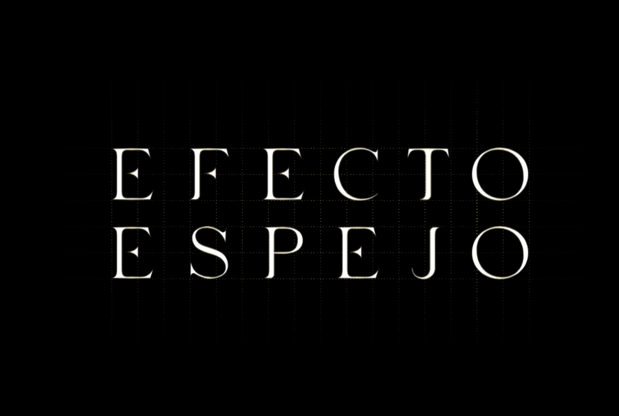
LOGOTYPE CONSTRUCTION
The Efecto Espejo logotype was created using a “Lavish” Font to infuse the brand with personality and style. The spacing between letters was carefully adjusted to maintain visual harmony and readability while aiming to strike the ideal balance between legibility and visual attractiveness. Brand Identity Project
ISOTYPE CONSTRUCTION
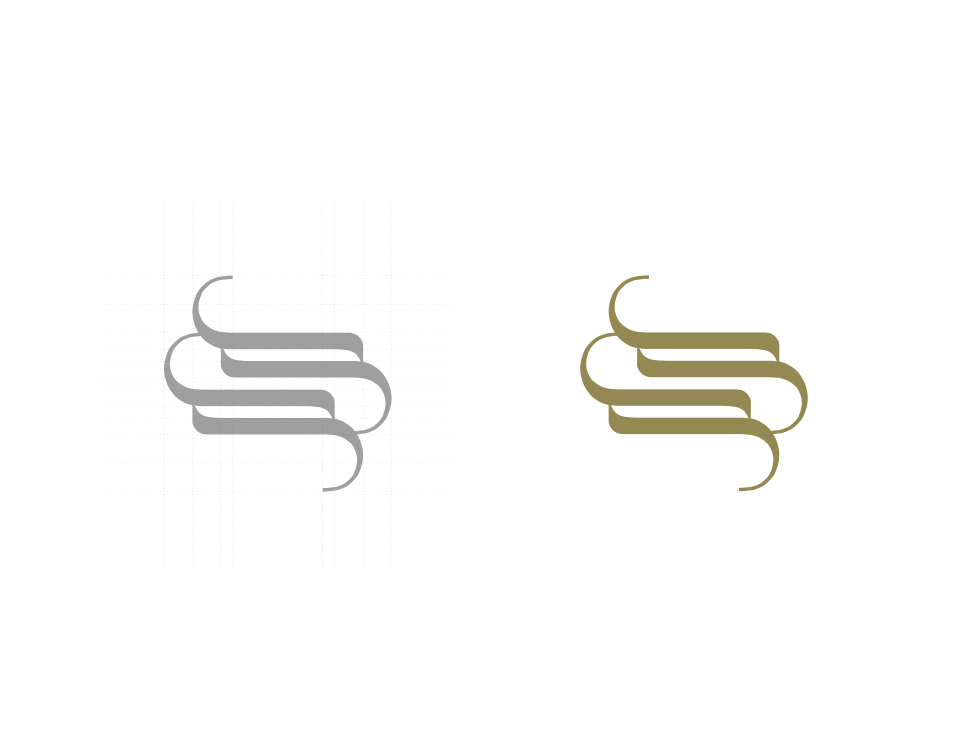
The isotype of Efecto Espejo was crafted using a lavish font, specifically the letter “J,” to embody the brand’s characteristics. This element conveys sophistication and elegance, echoing the style one might associate with a high-end fashion brand, evoking feelings of glamour and luxury. Brand Identity Project.
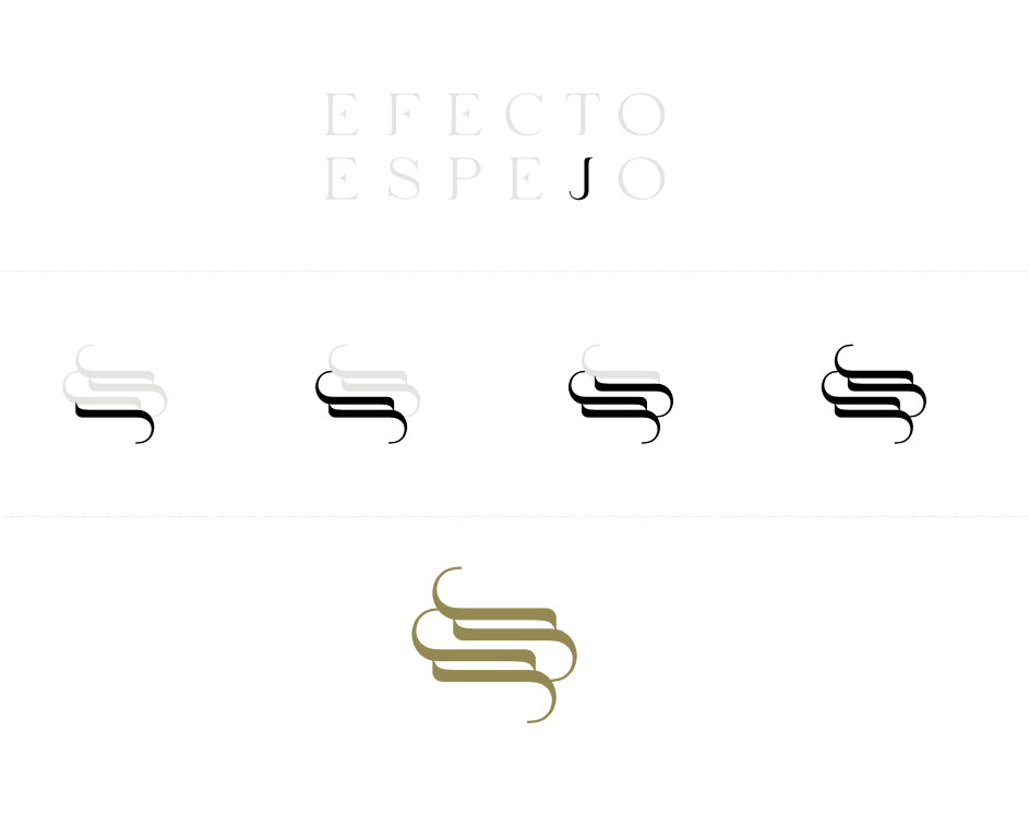
ISOTYPE
Efecto Espejo isotype concept reflects a combination of the principal attributes, service, and name:
Bright/Elegance/Luxury.
Our isotype is an extension of our wordmark, distilled to its purest essence. The isotype can be used as a favicon for browser tabs, as social media avatars, or as a secondary graphic element in swag.
The logo is versatile for offline (print materials) and online applications (web, app, social media), and they have a responsive version in which the isotype applications take over the logo’s role.
Brand Identity Project.
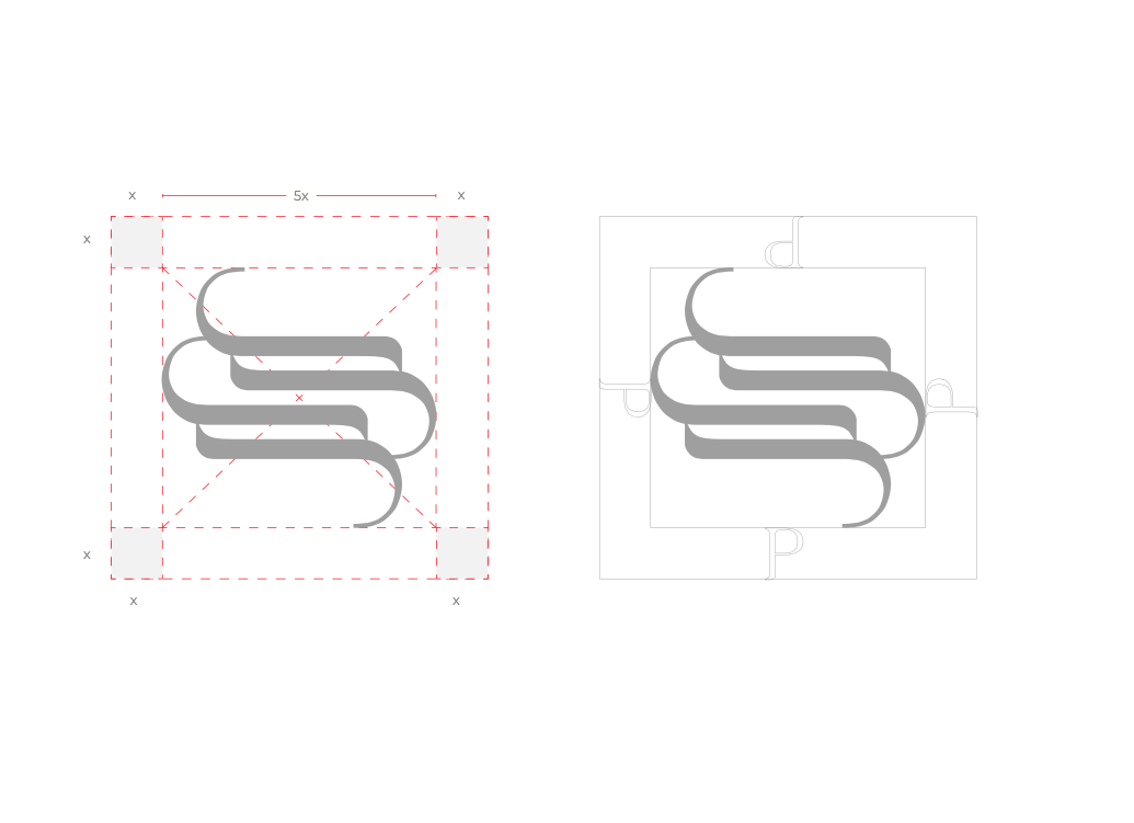
EXCLUSION ZONE
The isotype was constructed with a 5X x 5X proportion (square). The exclusion zone means “ 1x” places around this isotype. Using any graphics within the “1x” proportion is prohibited.
Using anything inside these “1x” will break the brand guidelines.
Brand Identity Project.
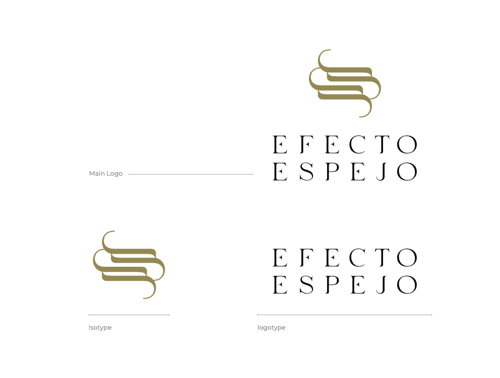
LOGO SYSTEM
The logo is designed to use primary as the main logo: Isotype and logotype.
The logo has secondary uses depending on applications, materials, and marketing purposes.
Brand Identity Project.
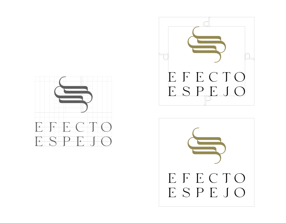
CLEARSPACE
The Efecto Espejo logo should always have a minimum amount of clear space to ensure optimal readability.
This space isolates the mark from any competing graphic elements, such as other logos or body copy, that may conflict with, crowd, or diminish the overall impact of our mark.
Primary logo version vertical.
• isotype
• logotype
Brand Identity Project.
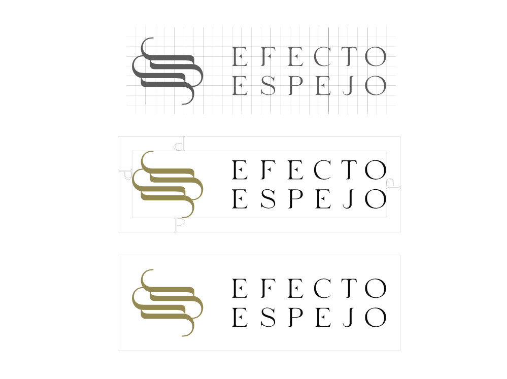
ALTERNATIVE VERSION 1
The Efecto Espejo logo should always have a minimum amount of clear space to ensure optimal readability.
This space isolates the mark from any competing graphic elements, such as other logos or body copy, that may conflict with, crowd, or diminish the overall impact of our mark.
Alternative logo version horizontal.
• isotype
• logotype
Brand Identity Project.
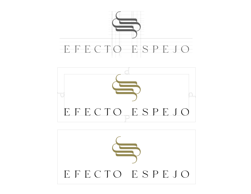
ALTERNATIVE VERSION 2
The Efecto Espejo logo should always have a minimum amount of clear space to ensure optimal readability.
This space isolates the mark from any competing graphic elements, such as other logos or body copy, that may conflict with, crowd, or diminish the overall impact of our mark.
Alternative logo version vertical.
• isotype
• logotype
Brand Identity Project.
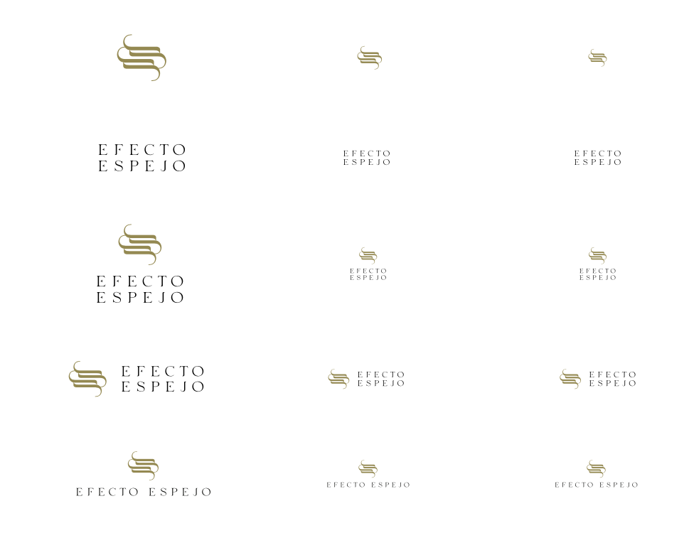
SIZE
For legibility, the logo should not be used anywhere (print or web) below the following sizes. If the logo is used below, it will lose clarity and beauty.
When the logo is used up to the sizes tested in each variation, it will keep its legibility intact.
Brand Identity Project.
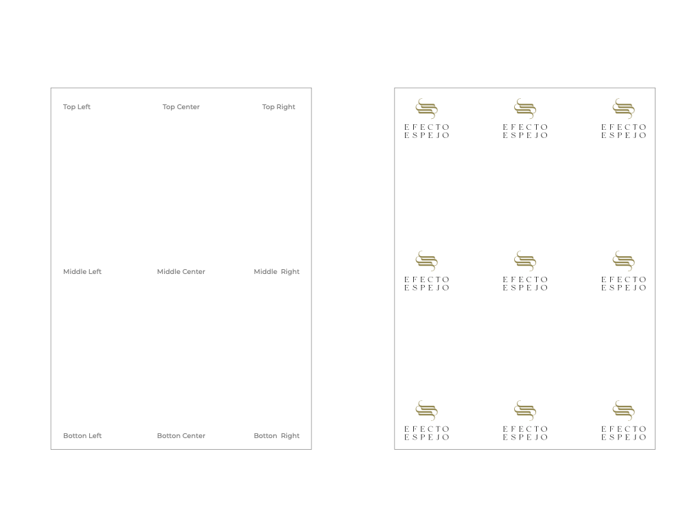
LOGO PLACEMENT
The logo should not be used anywhere on a page. The logo can lose its structure if used randomly anywhere on the page.
Brand Identity Project.
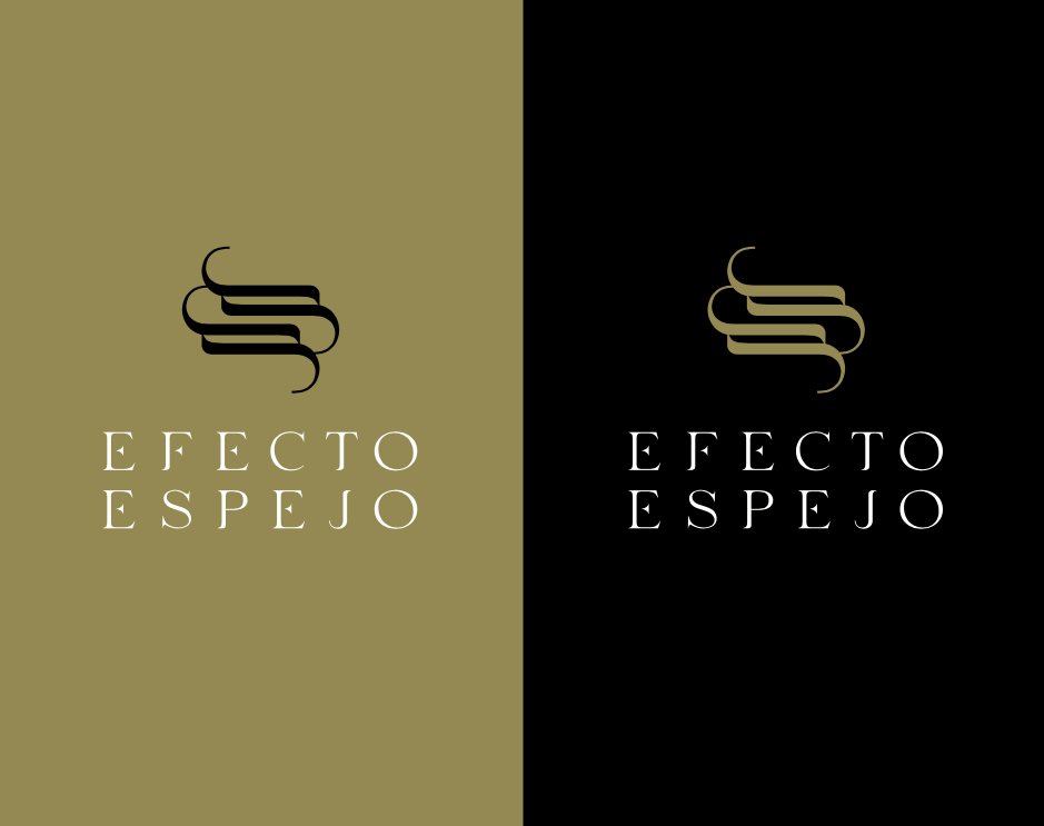
LOGO ON THE BACKGROUND COLOR
Gold & Black are our primary brand colors and should be the default choice when using the Efecto Espejo logo.
Additionally, we’ve developed alternate colorways to allow for more flexibility when gold isn’t an ideal choice (i.e., website packaging, materials, etc).
These colorways successfully pass color contrast testing.
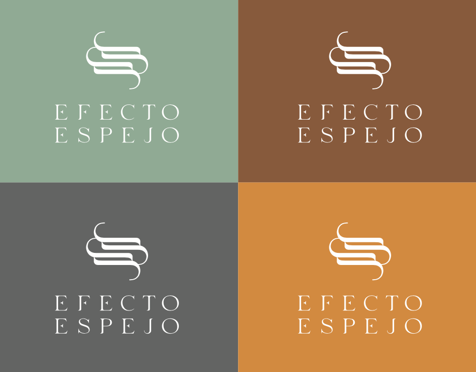
COLOR IN MARKETING
As shown here, our logo can appear in various colors for marketing purposes.
Offering options in this regard makes Efecto Espejo more engaging and relatable to customers, and it opens up more pleasing color harmonies when paired with illustration or photography.
These colorways successfully pass color contrast testing.
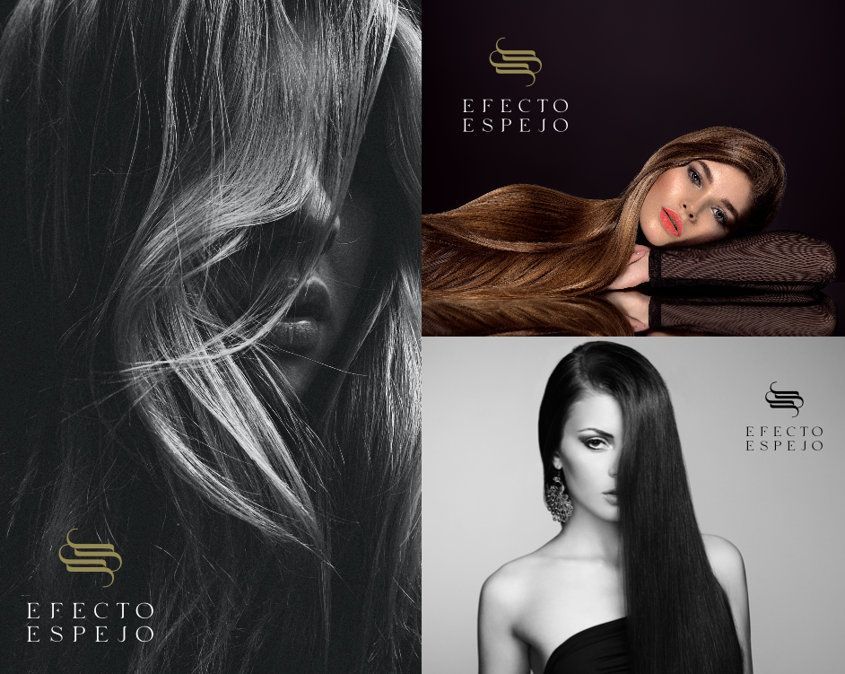
LOGO ON IMAGE
When placing the logo on the image, choose a precise image location. Also, Choose a separate area from the logo color on the image.
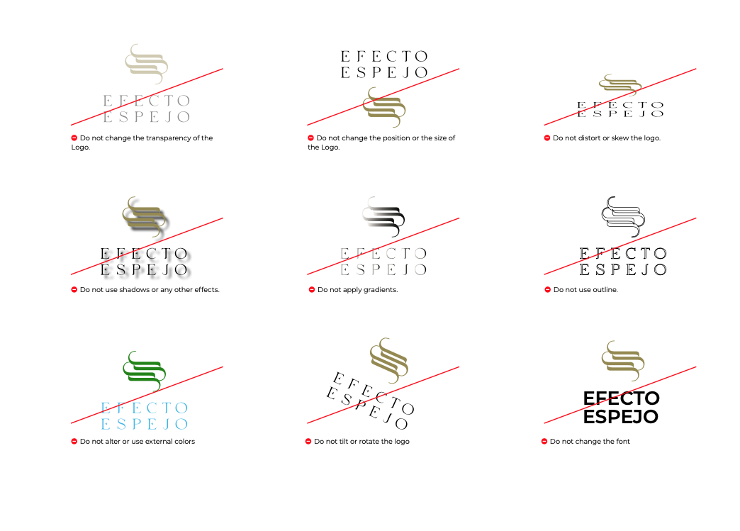
INCORRECT USAGE
Here’s what you shouldn’t do with our logo.
Remember that we convey an identity rooted in our values, and the best way to preserve it is to consistently and accurately present our brand and respect our brand guidelines.
Change the logo’s orientation or rotation.
Disproportionately scale the logo.
Change the logo’s colors.
Display the logo with color combinations not previously specified.
Display the logo in a configuration not previously specified.
Attempt to recreate the logo.
Make alterations to the logo’s text.
Add special effects to the logo.
Add an outline to the logo or display the logo as an outline.
Use the logo on top of busy photography.
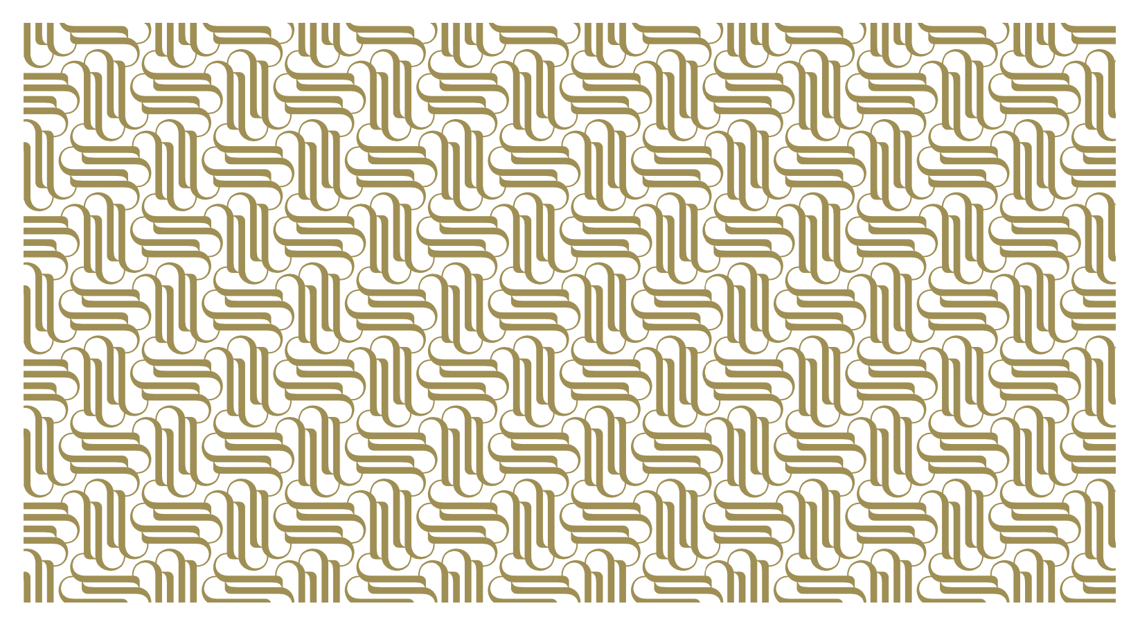
APP ICON
Efecto Espejo isotype can be used in different colors in social media and app formats.
03. COLOR
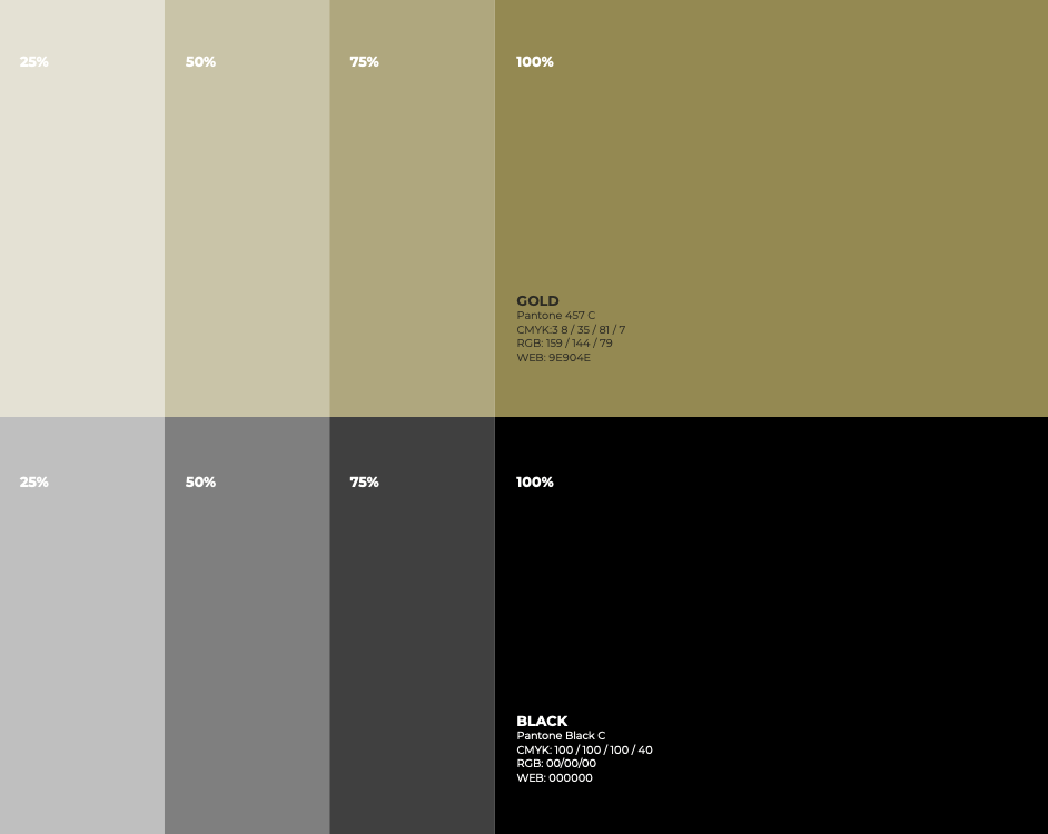
PRIMARY COLORS
Dominant Gold and black convey a sense of luxury and sophistication. The gold hue symbolizes opulence and exclusivity, enhancing the brand’s perceived value and credibility. The concept suggests transformation and radiant beauty, perfectly complemented by the glamour and allure associated with gold.
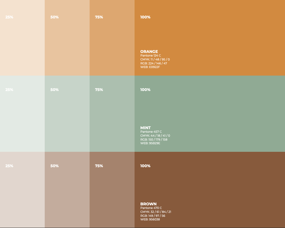
COMPLEMENTARY COLORS
The brand guides soft, soothing tones to create a calming and welcoming atmosphere.
04. TYPOGRAPHY
PRIMARY TYPEFACE
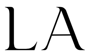
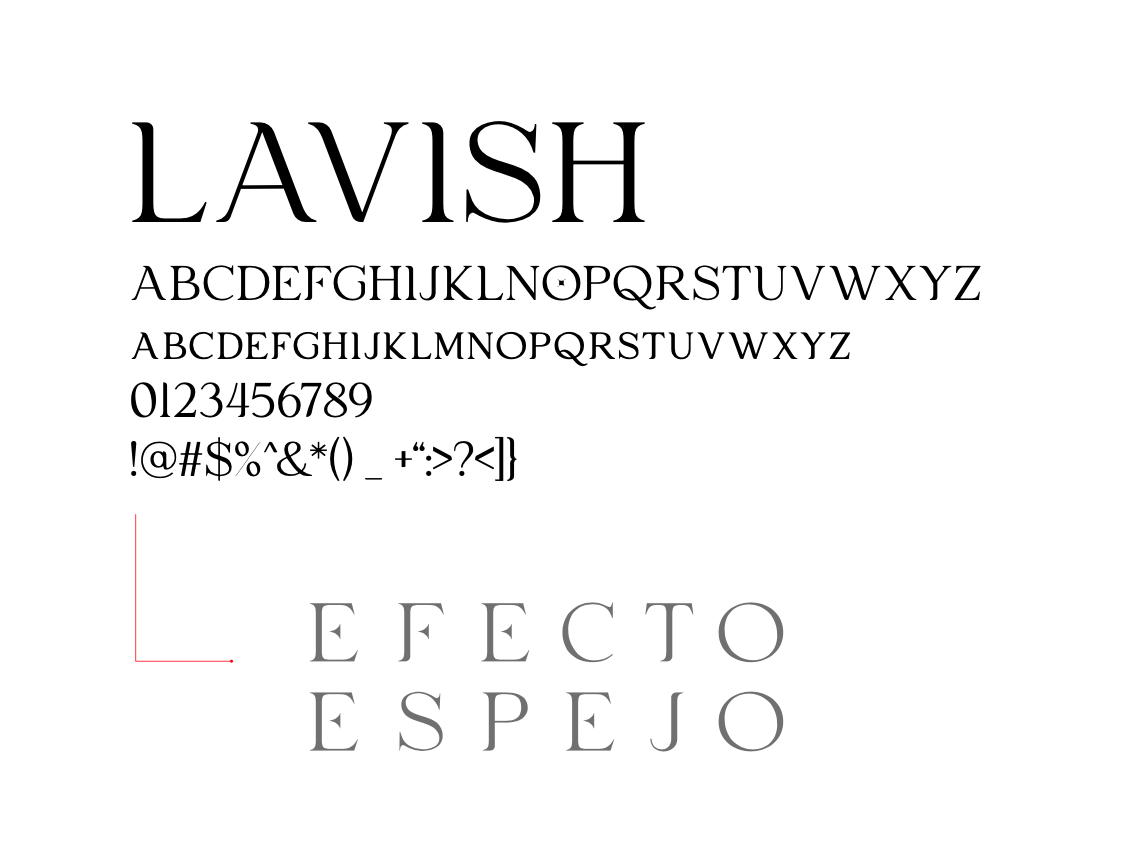
Lavish fonts epitomize elegance and refinement, captivating viewers with intricate details and graceful curves. These fonts exude a sense of opulence, adorned with stylish flourishes and ornate embellishments that evoke a feeling of luxury and sophistication. With their timeless charm and inherent beauty, lavish fonts add a touch of grandeur to the brand.
From sumptuous script styles to regal serif designs, lavish fonts command attention and leave a lasting impression to convey prestige and allure. Whether used sparingly for accents or prominently for headlines, lavish fonts lend an air of sophistication and refinement to any visual composition, elevating the overall aesthetic and captivating the imagination of discerning audiences.
SECONDARY TYPEFACE
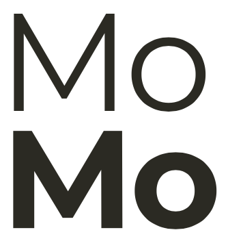
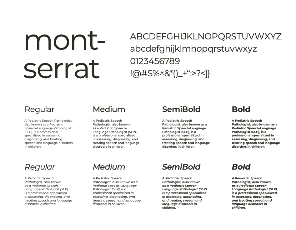
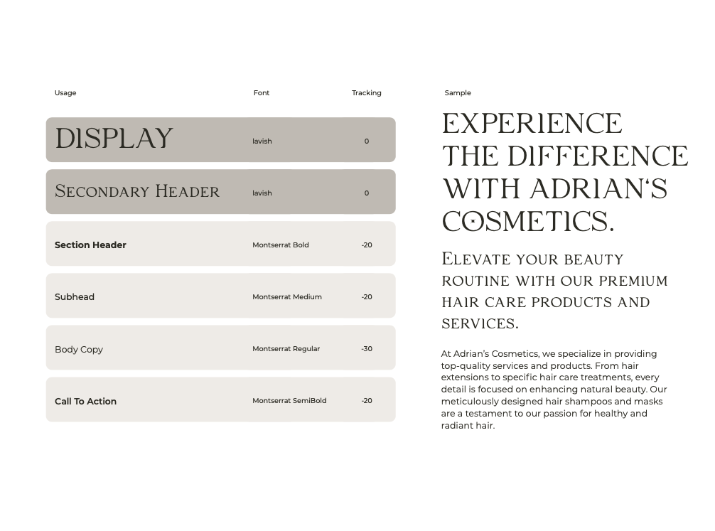
The Secondary Typeface is Montserrat.
This font family balances geometric precision and humanist warmth. Its clean lines and rounded terminals lend a friendly and approachable feel, while its uniform stroke width ensures clarity and legibility across different font weights and sizes. Montserrat’s extensive range of weights and styles offers flexibility for various design applications, from bold headlines to body text.
TYPOGRAPHY IN USE
The usage guide on the right shows best practices when setting type for most Efecto Espejo communications. The only derivation from this would be instances of large, longer copies that can be put in Lavish, as opposed to Montserrat.
Headlines should always be in sentence case (capitalize all letters). They should use end punctuation, except for specific graphic executions.
Section headers and subheads must be in sentence case, and end punctuation must be used.
The “call to action” must be in sentence case and use end punctuation.
05. IMAGERY
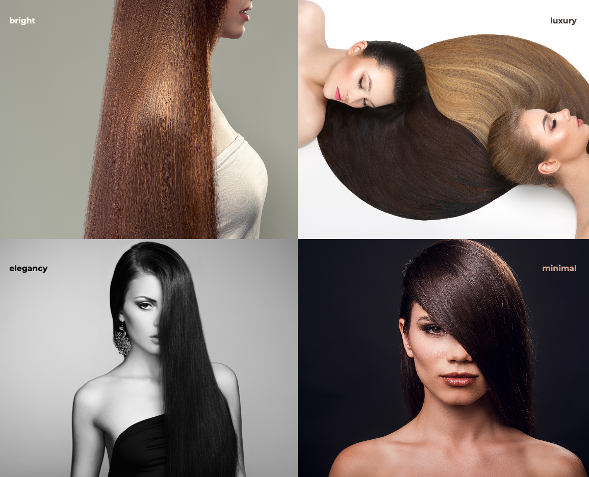
BRAND IMAGERY
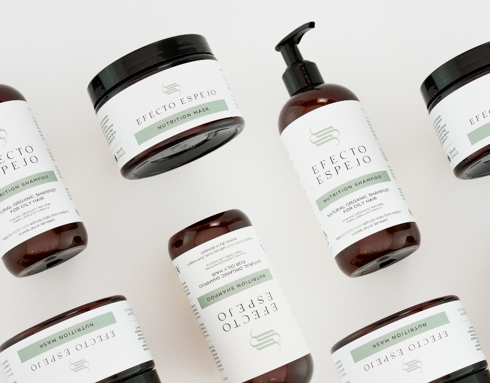
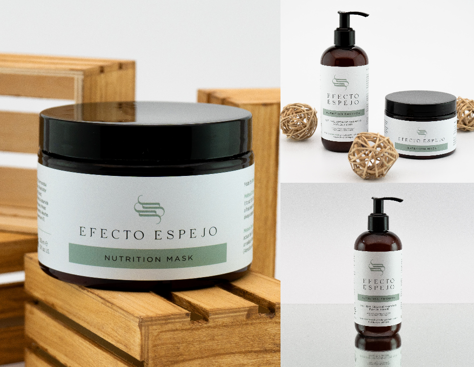
The following are some images that will speak for our business. By looking at the pictures, everyone will understand the product and its effect.
05. APPLICATIONS
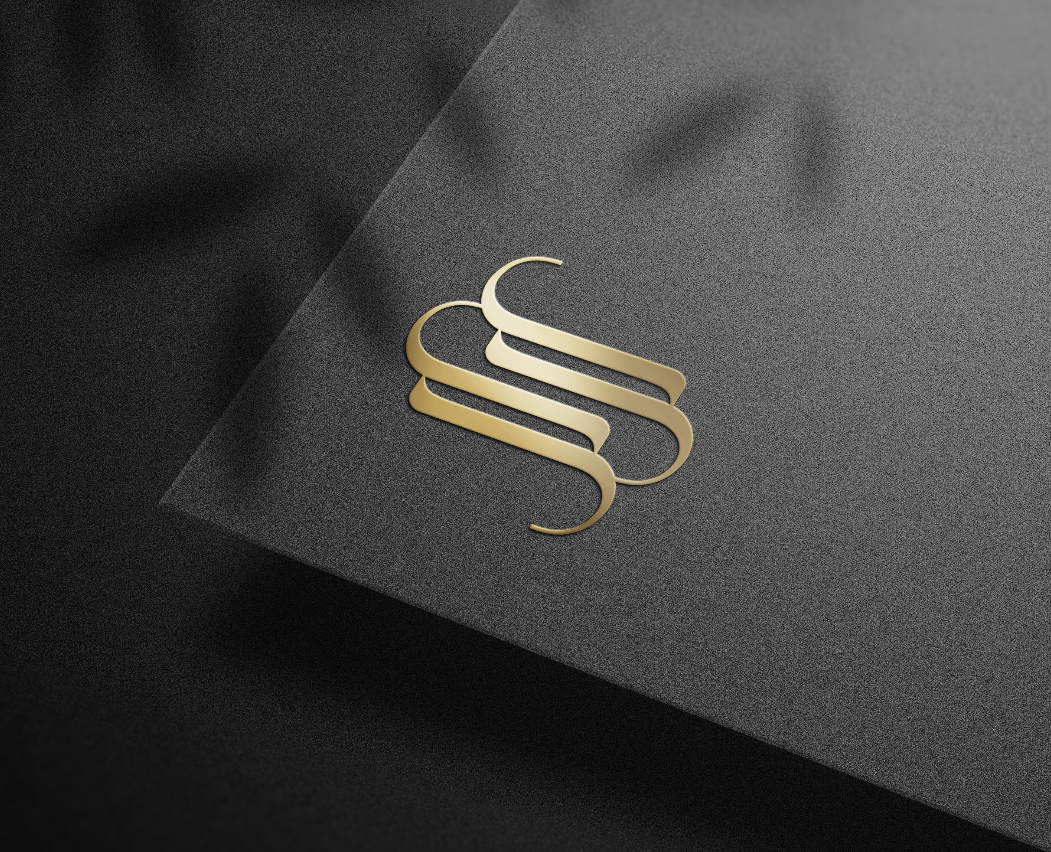
FOIL STAMP
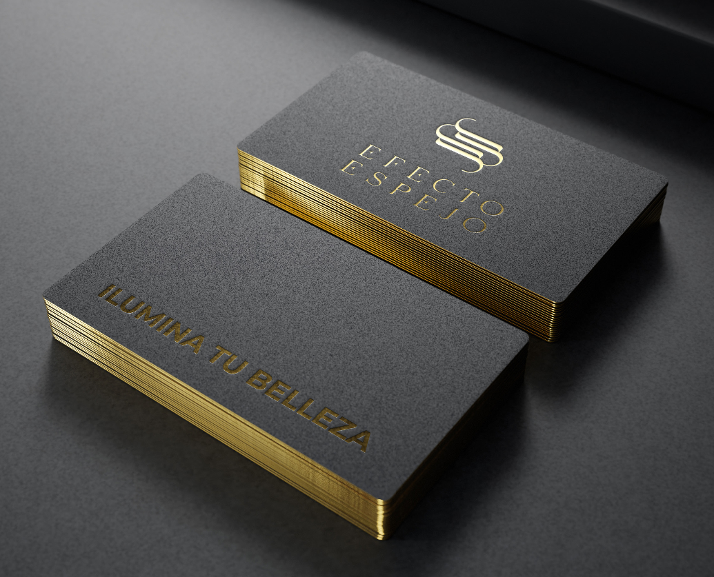
CARDS
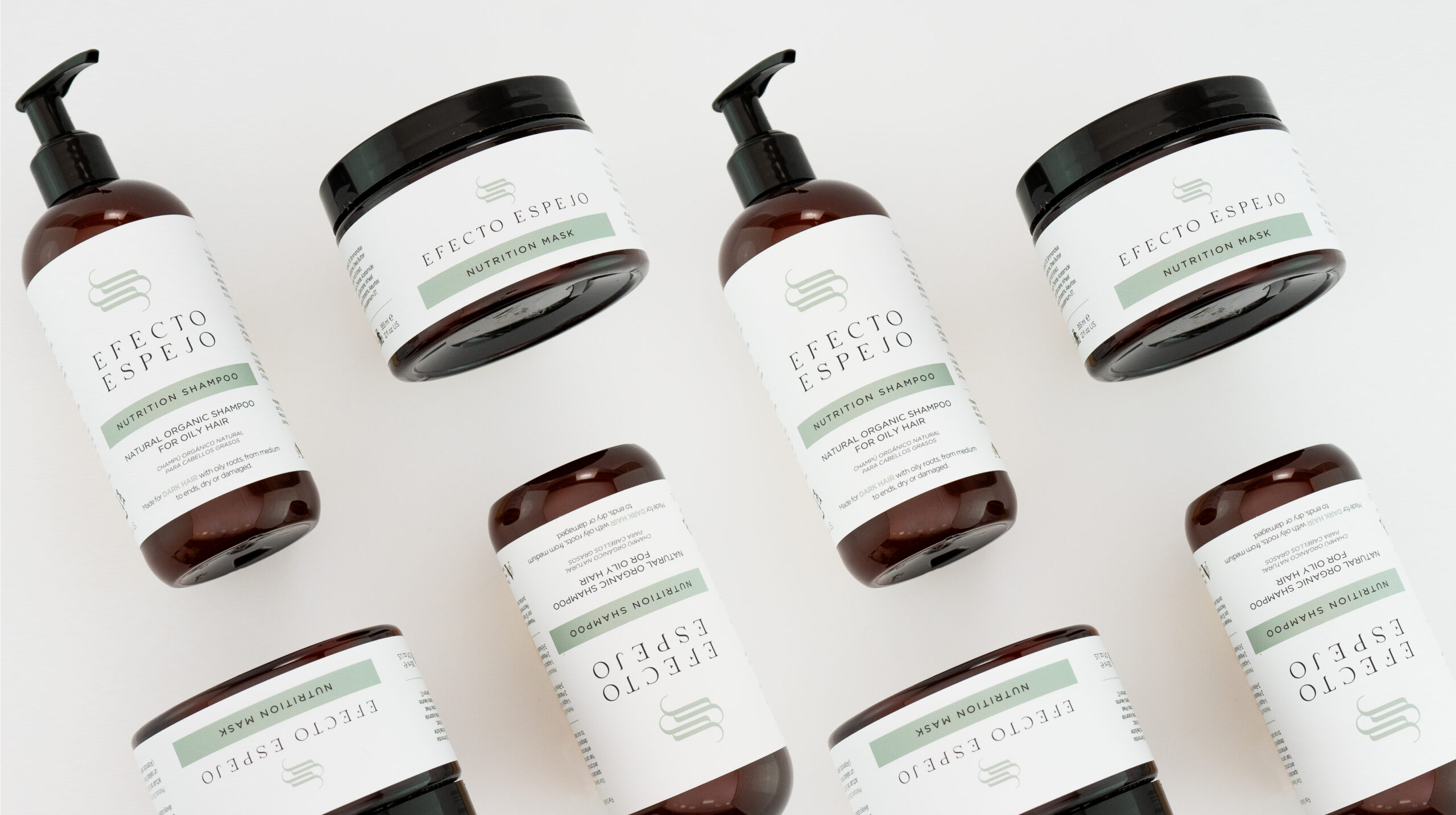
LABELS
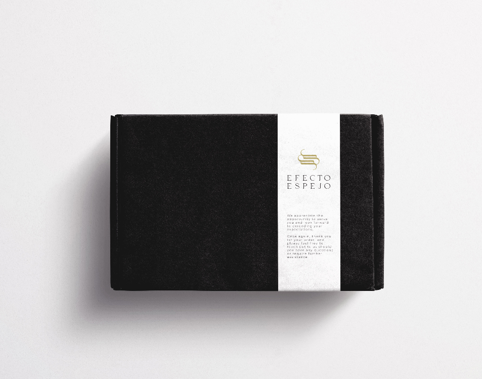
POSTAL BOX
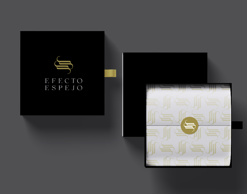
LUXURY GIFT PACK
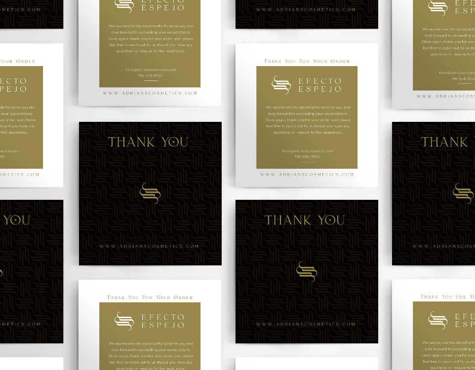
THANK YOU CARD
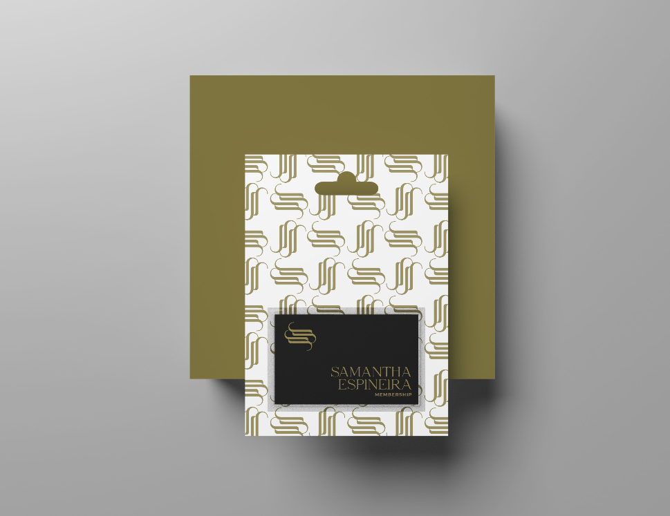
MEMBERSHIP CARD
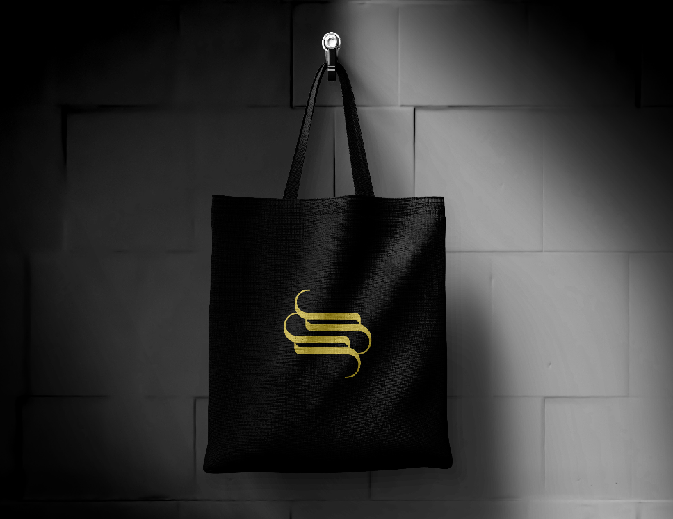
TOTES BAGS
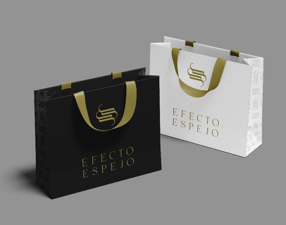
SHOPPING BAGS
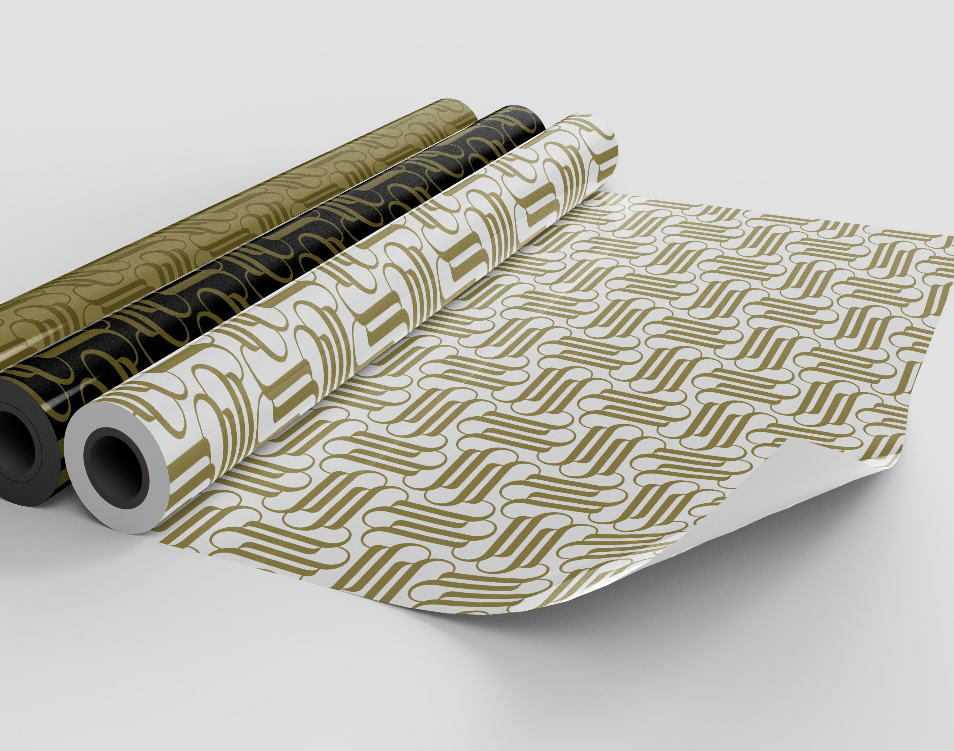
WRAPPING PAPER
